 I could wax lyrical on current trends in online readership and design strategies behind market domination but the truth is, the reason I changed the cover of my stand-alone adult novel
An Island Lost is as simple as this:
It's both good fun and a vital part of the creative process!
I love designing covers. It's a pet joy of mine. I love playing with images and fonts, colours and embellishments to create the most visually appealing book I can. Not just visually appealing, but visually relevant.
Because I like my covers to reveal the essence of my book.
Now that may seem like a no-brainer to you, but I am often disappointed by a book that promises one thing with its cover and delivers something entirely different with its content. You think, soft and dreamy and it turns out to be hard and dreary. Or vice versa.
 And don't get me started on all the dreadfully dull crime fiction that is published by traditional publishers. It is as though they have said, 'Let's try to say as little as possible with this cover.' By trying to be all things to all readers, they end up with a cover that is boring, banal and blah!
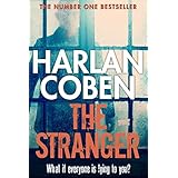
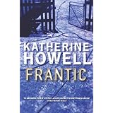
Aussie paramedic-turned-author Katherine Howell tops that list of offenders and, sorry Harlan Coben, but you're up there, too. I love both authors' words, but their covers don't tell me a thing.
An Island Lost, an evolving tale...

I am known for changing my covers, it's true, but this particular book has seen several manifestations in its four years of publication.
 I started with a slightly ominous, more masculine design in the early days which was done by a graphic designer by the name of Stuart Eadie. He did a great job, but I soon grew disappointed. It seemed too blokey to me and didn't really get the story across. It also seemed to alienate so many of my core readers—women.
So last year I did an about-face and redesigned the cover myself, this time with a very feminine look. I loved that cover, still do, but gradually have begun to wonder if it's a little too girlie. It looks like ChickLit and it's absolutly not that!
Back to the drawing board…
Recently, while pouring over images for my new Agatha Christie Book Club (cover reveal to come soon!), I found a photo that seemed perfect for An Island Lost—which is the story of a woman's journey back to her homeland, Papua New Guinea. The image is both fun and invigorating, and just slightly ominous. There's depth and there's illumination, and it's neither a book for men or a book for chicks. I think it encapsualtes the content perfectly.

But you be the judge! If you've read it, please let me know if you think this new-look cover better suits the book. If not, just let me know your thoughts, anyway.
Covers are not the most important part of a book, but they sure are fun to get right.
Happy (visually appealing) reading, everyone.
xo Christina